Design Decisions
Watercoolers, pure HTML/CSS, and two DJ-related links in this issue!
This is the watercooler at my gym:
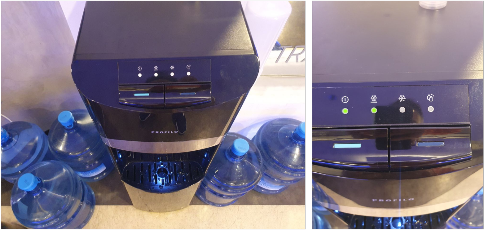
Each time I use it, I press the wrong button.
I don't like drinking cold water when I work out. Which button do I press for room temperature water? My first reaction was the right button. To me, the color on the left button is closer to ice, glaciers, so I thought it would give me cold water. So I pressed the right button.
Wrong. The button on the right is the cold water. I should have pressed the left button for room temperature water.
Why? I don't know. The only reason I can think of is the intensity of blue. The person who made the color decisions (I didn't say designer) probably thought that blue stands for cold. So they made the left button less blue, and the right button more blue. Therefore, left button less cold, right button more cold.
Or maybe they used the dark blue for cold in other models that offer hot, room temp and cold options, and they reduced the "blueness" for this model... Maybe the model wasn't even designed by a designer, maybe it was a stock kit from China that just got assembled. If you have a different interpretation, I'm really curious to know.
Common usages and habits
Our gym bought that cooler a couple of months ago. And I am still pressing the wrong button. Why? Because I also use other watercoolers that have better color mappings. White or silver for room temperature, blue for cold, red for hot, for example.
I wouldn't be having this issue if my gym watercooler used the same or similar color mapping.
But also realize that if all watercoolers used light turquoise for room temperature water, I wouldn't have this issue. Sometimes we need to go with usage patterns that are scientifically-proven to be worse, just because they are a part of a platform or they have been accepted as standard by user groups. Carousels, iOS glass, drawers on top of drawers, all fashion apps, form submit action on the top left corner of the form... These are examples of the watercooler light blue buttons in the digital experiences.
When we design, we might be caught up with the desire to do things slightly differently. Maybe to put our own spin on it. Or maybe we are thinking too much with a marketing mindset - it is all about US US US US look at US US.
It is important to look around us, learn the platform guidelines, and be very careful when deviating away from known patterns. I spend more time on Mobbin than on dribbble/behance, because actual UIs are more useful in learning about better layouts.
Website update
I started working on my website, again!
The last major update was last summer, and I received a lot of good feedback about what worked and what didn't. I was busy thinking about how to integrate the feedback, first at the content level, then in the visual level. I also had many new ideas about how I can better convey what I do. Most of them didn't work :)
I am excited about how it is coming together. I am equally excited about the workflow. I started on paper, then did very simple HTML/CSS sketches, then went back to paper until things gelled in my mind. In parallel, I edited my old files for better content. I then redrew my sketches in Figma, in very low fidelity but using the final-ish content, until I felt good about them. My criteria at this stage: it should be as simple and straight-forward as the way that I work with clients.
I am done with this stage and started implementing everything in pure simple HTML/CSS this week. No frameworks. Instead of spending time to do frontend pre-development in Figma (aka auto layout) I am giving that time towards coding and revising the layout and content as I go.
Hopefully you'll see it in a few weeks :) DM me on LinkedIn if you want to see the preview environment, I'm always open to feedback.
Bonus: Probably not for the first release, but I am also working on a theme switcher, like the old CSS Zen Garden 🤗 I want to have a Netscape 1997 style and a Teletext style. I might do cheesy AI after those.
The Pit of the Artificial
Cognitive Surrender: A very accessible summary of the method and the take-aways in a recent paper that studied how LLMs impact decision-making. Spoiler: They displace decision-making, you just accept what they say.
Sycophancy is the first LLM deceptive design pattern: Sean Goedecke, a full year ago, named this behavior as it should be called.
If you are saying "wait that is not too bad?", "Wait, but we are product people and we are responsible for increasing the engagement", "Wait, good design is seamless, it creates immersive experiences", the next link is for you.